SQLite ERD Viewer: Visualizing Database Schemas with Beautiful Diagrams
A deep dive into building SQLite ERD Viewer, a native macOS app that transforms SQLite database files into interactive, color-coded Entity-Relationship Diagrams using Swift and SwiftUI
Ever opened a SQLite database and tried to understand how all the tables relate to each other? You're staring at table names like user_roles, order_items, and payment_transactions, trying to mentally map out foreign keys and figure out what connects to what. I built SQLite ERD Viewer to solve that problem—a native macOS app that turns your SQLite database files into beautiful, interactive Entity-Relationship Diagrams.
The Problem: Invisible Database Structure
When working with SQLite databases, understanding the schema is crucial. Whether you're inheriting a legacy codebase, debugging data issues, or onboarding onto a new project, you need to see how tables connect. Most database tools show you tables as lists—you get column names and types, maybe foreign key constraints, but visualizing the relationships requires mental gymnastics.
What if you could just drag a .sqlite file onto an app and immediately see the entire schema laid out as a professional diagram, with relationships automatically drawn and tables intelligently color-coded by their semantic role?
That's exactly what SQLite ERD Viewer does.
See Your Database at a Glance
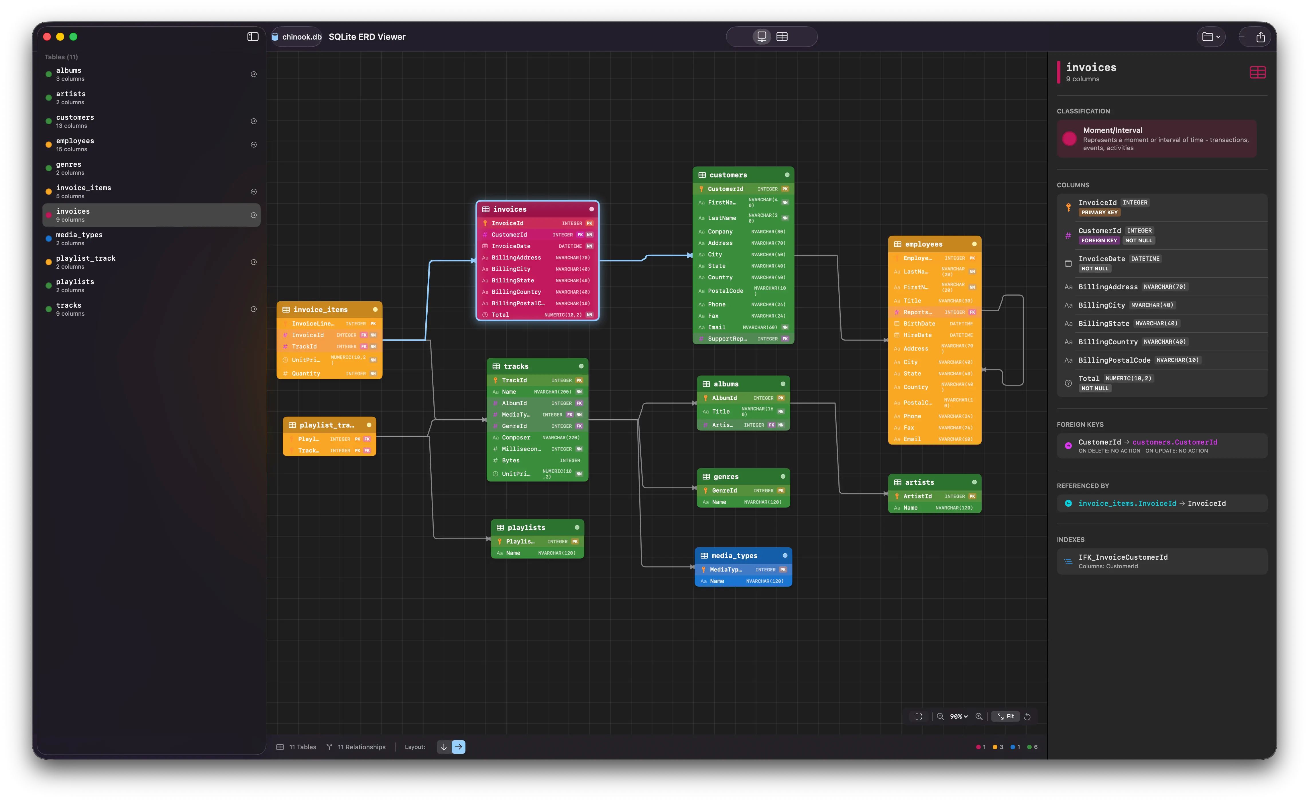
The app generates interactive ERD diagrams that show every table, column, and relationship in your database. Tables are rendered as cards showing column names, data types, and constraints. Foreign key relationships appear as connection lines between tables, making it immediately obvious how your data model fits together.
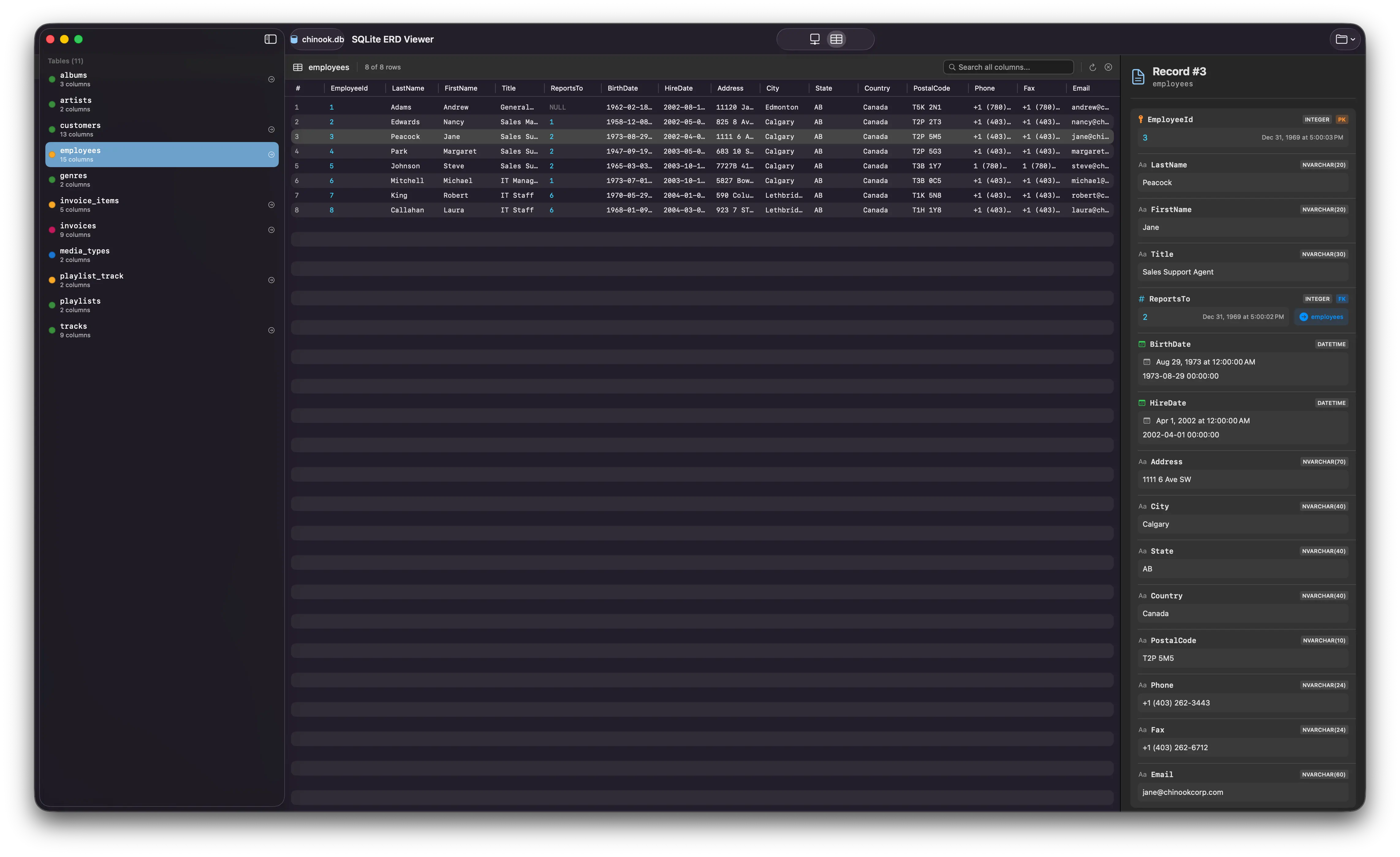
Simply drag and drop any SQLite file (.sqlite, .db, .sqlite3) onto the app window, and watch your schema come to life.
Smart Domain Color Classification
One of the features I'm most excited about is automatic domain color classification. The app doesn't just show you tables—it helps you understand their purpose in your data model using Peter Coad's domain color modeling:
| Color | Classification | Examples |
|---|---|---|
| 🟣 Pink | Moment/Interval | orders, payments, bookings, events, logs |
| 🟡 Yellow | Roles | user_roles, memberships, permissions, assignments |
| 🔵 Blue | Description | categories, types, statuses, settings, configs |
| 🟢 Green | Party/Place/Thing | users, products, locations, companies |
This classification happens automatically based on:
- Table naming patterns — Tables containing words like "order", "payment", or "transaction" are classified as Moment/Interval (pink)
- Foreign key analysis — Tables with multiple foreign keys and few additional columns are likely join tables (yellow)
- Column patterns — Tables with just
id,name,code, anddescriptioncolumns are likely lookup tables (blue)
// Domain color classification logic
static func classifyTable(_ table: TableSchema, allTables: [TableSchema]) -> TableColor {
    let nameLower = table.name.lowercased()

    // Check for join table (likely a role/association)
    if isJoinTable(table, allTables: allTables) {
        return .yellow
    }

    // Moment-Interval (Pink) - business activities
    if matchesKeywords(nameLower, keywords: momentIntervalKeywords) {
        return .pink
    }

    // Default: Party, Place, Thing (Green)
    return .green
}
When you open a database, you can immediately see that your green tables are your core entities (users, products), pink tables represent business events (orders, payments), and yellow tables handle relationships between them. It's like having a data architect review your schema automatically.
The Technical Stack
SQLite ERD Viewer is built entirely in Swift 6 and SwiftUI, leveraging Apple's latest frameworks for a native macOS experience.
Key Technologies
- SwiftUI for the entire user interface
- GRDB.swift for SQLite database introspection
- Sugiyama Algorithm for automatic graph layout
- Canvas API for performant diagram rendering
Intelligent Auto-Layout
Getting tables to arrange themselves nicely without overlapping is surprisingly hard. The app uses a Sugiyama-style layered graph layout algorithm:
/// Apply automatic layout using improved Sugiyama algorithm
static func applyLayout(to tables: [TableSchema], configuration: LayoutConfiguration) -> [TableSchema] {
    // Step 1: Assign layers using longest-path method
    let layers = assignLayers(tables: tables, nameToIndex: nameToIndex)

    // Step 2: Order nodes within layers to minimize crossings
    let orderedLayers = minimizeCrossings(layers: layers, tables: tables, nameToIndex: nameToIndex)

    // Step 3: Assign coordinates based on layer order
    var positions = assignCoordinates(orderedLayers: orderedLayers, tables: tables, configuration: configuration)

    // Step 4: Resolve any remaining overlaps
    positions = resolveOverlaps(tables: tables, positions: positions, configuration: configuration)

    return tables.enumerated().map { index, table in
        var updated = table
        updated.position = positions[index]
        return updated
    }
}
The algorithm:
- Assigns layers using the longest-path method, so tables flow naturally from independent entities to dependent ones
- Minimizes edge crossings using barycenter and median heuristics with multiple passes
- Routes edges orthogonally for clean, professional-looking diagrams
- Resolves overlaps with iterative position adjustments
The result is a diagram that arranges itself intelligently—tables that reference each other end up close together, and the overall flow makes logical sense.
Orthogonal Edge Routing
Connection lines between tables use orthogonal routing (only horizontal and vertical segments), which looks much cleaner than diagonal lines. The routing algorithm considers table positions and avoids overlapping other nodes:
// Route a single orthogonal path between two tables
private static func routeOrthogonalPath(
    from fromTable: TableSchema,
    to toTable: TableSchema,
    obstacles: [CGRect],
    configuration: LayoutConfiguration
) -> [CGPoint] {
    // Determine best connection sides based on relative positions
    let (fromSide, toSide) = determineBestSides(from: fromPos, to: toPos, direction: configuration.direction)

    // Calculate port positions on table edges
    let fromPort = portPosition(for: fromTable, side: fromSide)
    let toPort = portPosition(for: toTable, side: toSide)

    // Route using orthogonal constraints
    return findOrthogonalPath(from: fromPort, to: toPort, obstacles: obstacles)
}
Features Deep Dive
Interactive Canvas
The ERD canvas supports all the navigation you'd expect from a professional diagramming tool:
- Pan: Click and drag to move around the diagram
- Zoom: Pinch to zoom, or use the zoom controls for precise levels
- Marquee Zoom: Draw a rectangle to zoom into a specific area
- Table Dragging: Rearrange tables by dragging them to new positions
- Fit to View: Automatically zoom and center to show the entire diagram
Table Detail Panel
Click any table to see comprehensive details in the right panel:
- Column names and data types
- Primary key constraints
- NOT NULL and UNIQUE constraints
- Foreign key relationships
- Index information
Export Options
Save your diagrams for documentation or presentations:
- PNG — Perfect for embedding in documentation
- JPEG — Smaller file size for web use
- PDF — Vector format for printing or zooming
Dark Mode Support
The app fully supports macOS dark mode. The diagram colors are carefully chosen to look great against both light and dark backgrounds, and the grid pattern adjusts automatically.
Privacy First
SQLite ERD Viewer runs completely locally on your Mac. Your database files are never uploaded anywhere—all schema introspection happens on your device. This is particularly important when working with databases containing sensitive data.
The Journey
Building SQLite ERD Viewer was an exercise in graph algorithms and SwiftUI's Canvas API. The hardest parts were:
- Crossing minimization — Getting the Sugiyama algorithm to produce consistently good layouts required implementing multiple heuristics (barycenter, median, sifting) and running multiple passes
- Orthogonal edge routing — Making connection lines that don't look like spaghetti took careful consideration of port positions and intermediate waypoints
- Performance — Large schemas with 50+ tables need efficient rendering, which meant using SwiftUI's Canvas for diagram drawing rather than stacking Views
The domain color classification was a fun addition that came from my background in data modeling. Peter Coad's color modeling approach has been around since the 90s, but it's surprisingly effective at helping you quickly understand a database schema's structure.
Try It Yourself
If you work with SQLite databases and want to understand their structure at a glance, give SQLite ERD Viewer a try. Whether you're debugging a mobile app's local storage, exploring a dataset, or documenting your database schema—the visual ERD makes everything clearer.

Download SQLite ERD Viewer
Free download for macOS 15 (Sequoia) or later.
⬇️ Download SQLite ERD Viewer v1.0 (5.7 MB)
SQLite ERD Viewer requires macOS 15 (Sequoia) or later.